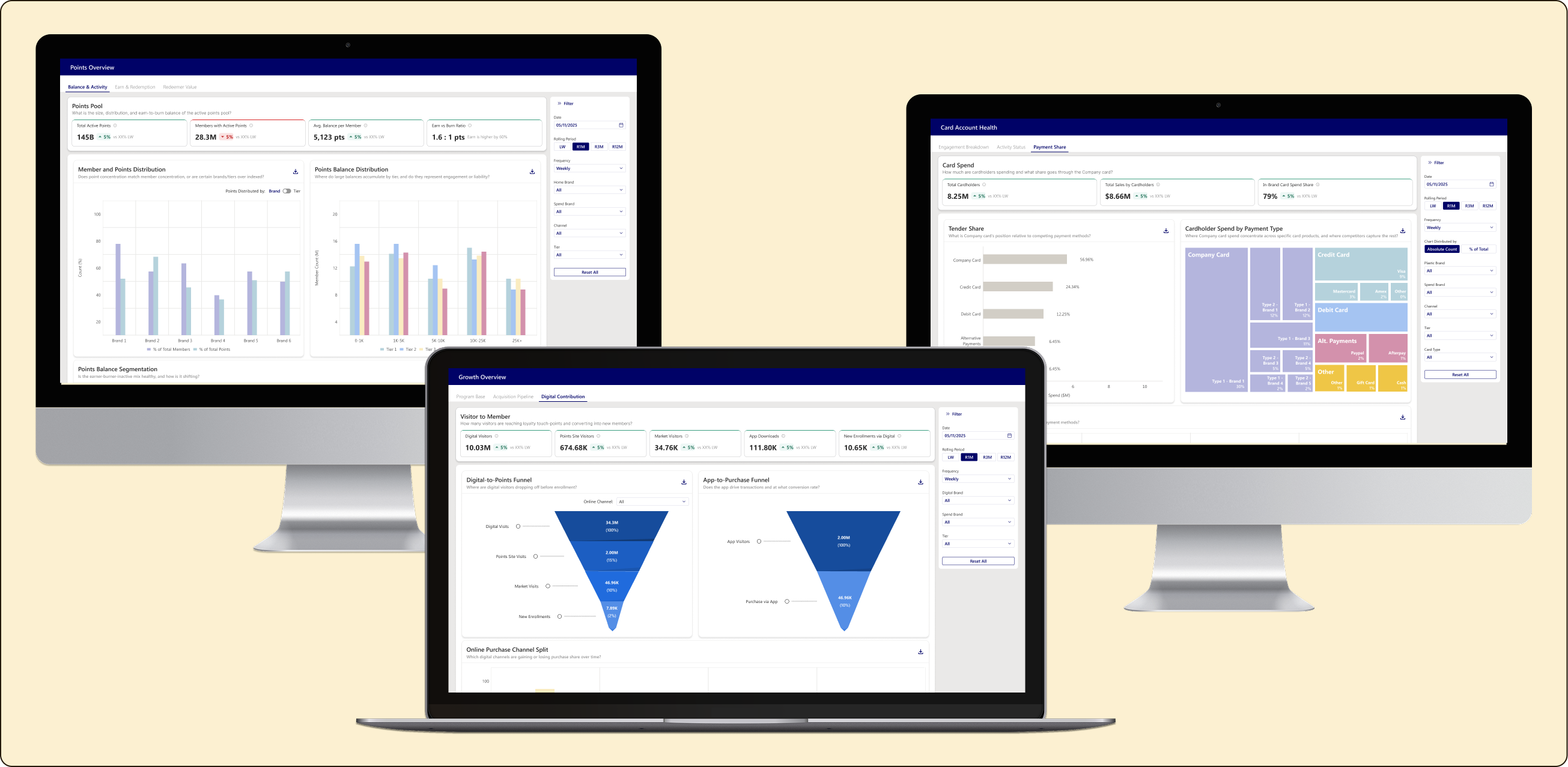
Points Program 2.0
Creating Clarity Across a Complex Data Ecosystem
overview
Role
Product design (UX/UI)
timeline
4 months
tools used
figma
Content has been sanitized to protect confidentiality while maintaining process integrity
problem
The company’s Points Program was evolving, with new marketplace features, partner integrations, and tier structures launching. However, the data infrastructure wasn’t keeping pace with the growth. More than 189 metrics were scattered across 15+ dashboards with inconsistent drill-down paths and unclear relationships. Overall, managers couldn’t find the information they needed when they needed it.
goal
Design a dashboard system that turns fragmented data into actionable intelligence.
process
discovery
define
design
Approach
Establish a framework based on the information that was provided initially. From a flat list of 189+ metrics, I created logical groupings and assumptions about users’ needs to be validated during the user interview stage.
User Interviews
I presented the framework to the Points Program’s Director of Insights and Analytics. This conversation focused on reviewing the proposed information structure, workflow, and assumptions made during the initial research phase. Together, we evaluated whether the groupings aligned with how the team consumed and analyzed data, identified any gaps or missing considerations, and determined the necessary tweaks and refinements required before moving forward.
Key Finding
Each user accessing the dashboards will be asking fundamentally different questions of the same underlying data.
Information Architecture
With this understanding, I was able to build out a five-layer hierarchical system designed to support multiple user journeys and provide a more intuitive way to navigate the data.
- Layer 1: Global Context – The navigation layer with persistent filters across all views: Brand, Channel, and Tier.
- Layer 2: Dashboard Categories – Organizes dashboards based on the primary business questions being addressed:
- Program Operations: Focuses on growth, economics, and ROI validation.
- Business Management: Focuses on member benefits and promotion analysis.
- Layer 3: Dashboard Tabs – Defines the specific workflows within each category, organizing related views and insights around user needs.
- Layer 4: View Modes – Centers around the same business functions while using different data perspectives to target specific insights and analysis needs.
- Layer 5: Drill-Down Paths – Enables interactive exploration through time periods, comparison modes, and rolling periods, allowing users to select visualizations and investigate deeper into the underlying data.
This architecture allows users to begin with a broad understanding of performance and progressively drill into specific insights without losing context throughout their analysis journey.
Design and Iteration
When developing the low-fidelity wireframes, there were several key considerations I kept in mind:
- Progressive disclosure: Default to insights rather than raw numbers. Ensure the most important information is surfaced first, while providing additional details when needed.
- Contextual metric grouping: Organize metrics based on user behavior and analysis patterns, rather than arbitrary categories. This included accounting for rolling aggregations, comparison patterns, and daily additive metrics.
- Action-oriented analysis: Ensure every view connects metrics back to business context and supports meaningful decision-making.
- Self-service by design: Build dashboards for a diverse group of stakeholders who need to answer their own questions without relying on external analysts.
- Narrative structure: Each dashboard should tell a coherent story rather than simply display individual data points.
With these principles in mind, I created low-fidelity wireframes to validate navigation patterns and overall workflow structure before moving into visual design. This was an iterative process, where stakeholders reviewed the wireframes and user flows, providing feedback based on their real-world usage patterns and analytical needs.
Based on stakeholder reviews and validation, I finalized the following dashboard structure:
- Program Operations: Is the points program healthy, growing, and generating value?
- Growth Overview: Is the program growing, from where, and at what quality?
- Program Base
- Acquisition Pipeline
- Digital Contribution
- Spend Overview: How are members spending, through which payment methods, and in what behavioral patterns?
- Member & Tier
- Behavior & Tender
- Points Overview: Is the points economy balanced, and are redeemers more valuable than non-redeemers?
- Balance & Activity
- Earn & Redemption
- Redeemer Value
- Card Account Health: Is the card portfolio growing, are cardholders engaged, and is the Company card winning wallet share?
- Account Health
- Engagement Breakdown
- Payment Share
- Out-of-Brand Activity: Where are cardholders using their card outside the company, and are cross-channel members the most valuable?
- Engagement & Spend
- Categories & Merchants
- In-Brand vs. OOB
- Growth Overview: Is the program growing, from where, and at what quality?
- Business Management: Are member benefits and promotions delivering returns?
- Member Benefits: Are the marketplace and partnerships converting traffic into engagement and redemptions?
- Market Performance
- Partnership Performance
- Promotional Performance: Are promotions generating profitable sales, or is discounting eroding margin?
- Member Benefits: Are the marketplace and partnerships converting traffic into engagement and redemptions?
Finalized Design
Once the low-fidelity wireframes were approved, I moved into creating the high-fidelity designs using the same iterative approach. The high-fidelity designs introduced a consistent visual language across the experience while maintaining the validated structure and workflows established during the earlier phases.
The final solution transformed 15+ disconnected dashboards into two decision-driven systems with a clear five-layer navigation structure. This new framework allowed stakeholders to move from high-level business questions into more detailed analysis paths while maintaining context throughout their journey. By organizing information around user needs and decision points, stakeholders were able to independently find the insights they needed and answer their own business questions without relying on additional analyst support.
 olivia frank